Tweet [1]
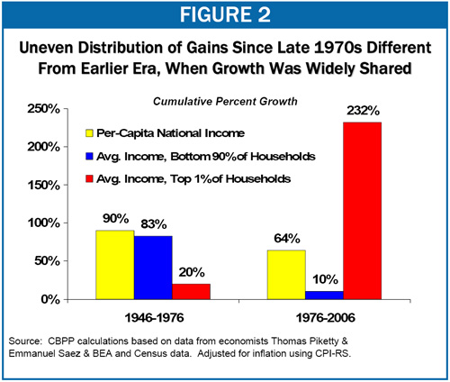
In this earlier post [2], I challenged readers to challenge this chart:
Write ONE sentence explaining ONE thing that is wrong with concluding
that these numbers are evidence that the US economy has become more
tilted toward the rich at the expense of the poor.
There were 206 responses before I cut off the comments.
It’s a pretty stark and dramatic picture. On the surface, it seems to indicate that the only people who got ahead in America over the last 30 years are the richest of the rich, the top 1%. The bottom 90% saw essentially no improvement. And this was mostly during a time when the economy was booming. The goal, I believe, of the people who draw such charts, is to destroy the argument that a rising tide lifts all boats. And the chart seems to show that.
So what is wrong with concluding from the chart that the economy is broken or at least hopelessly tilted toward the rich?
The most important argument made was that there are compositional changes that might account for the depressingly small improvement for the bulk of the population:
IRONMAN said it very simply: The composition of U.S. households has changed from 1946 through 1976 and through 2006.
A number of you speculated on what the changes might have been. ROSS wrote: There is inconsistency in the data because these numbers are for households and not individuals and will be affected by changes in the marriage and divorce rate.
ESOX LUCIOUS wrote: Immigration heavily skews the data for the poor to become poorer because quite a few of the immigrants arrive in a state of poverty.
MESA ECONOGUY was definitely on the right track: The comparison of household income is fake, because the number of households has increased at a much faster rate than the number of people (due mostly to divorce), creating artificially plummeting incomes per household, but nearly constant income per person.
These points are correct. Of course, they don’t refute the implicit claim of the chart. But they do make you wonder.
In support of the importance of the argument, between 1976 and 2006, the population in the US rose from 218 million to 300 million, an increase of 38%. But in the Piketty and Saez data, the data used to create the chart, the number of taxpaying units, which is actually their estimate of the number of households, rose 63%. So there has been an enormous increase in smaller households. The main factor, presumably, is an increase in the divorce rate over the period.
Even if single women earned the same amount as their husbands (and my guess is that they did not), an increase in the divorce rate would depress any growth in average household income.
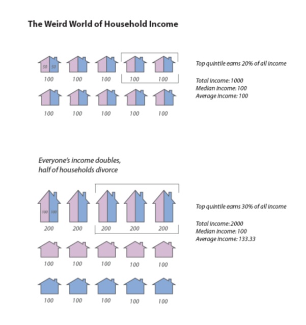
Here’s a simple illustration of this distorting effect, taken from page 20 of my visual essay, Half Full [4],:
 [5]
[5]
Every individual’s income doubles, but at the same time, half of the households divorce. Even though everyone’s income has doubled, the growth in household income is only 33%, rather than 100%. Median household income is unchanged, even though the median individual has seen 100% growth in income.
In creating this example, I was interested in the distortions caused by looking at quintiles rather than the top 1% or bottom 90%. But let’s look at what has happened to the bottom 80% in this example. The average income of the bottom 80% of households in the first situation is 100%. After divorce and a doubling of everyone’s income, the average income of the bottom 80% has increased by only 17%. (There are 12 households in the bottom 80% and their total income is $1400. So average is $117.)
How important is this effect? I don’t know. But as I point out in Half Full [4], there is evidence that most Americans are doing much better than they were in the 1970s.
There were many other good points made in the comments that are relevant. I liked PATRICK’s observation: The chart shows that the incomes of the top 1% have increased at a higher rate than those of the bottom 90% of households, any argument as to the "cause" of this discrepancy can not be inferred from the numbers alone and must be considered speculation or guess-work.
Sensible points about the fishiness of the choice of starting date and breakpoint of 1976 were made by UNIT, LOWCOUNTRYJOE, BRET, and KIRZNER FERVOR.
Thanks to everyone who participated in the contest.
