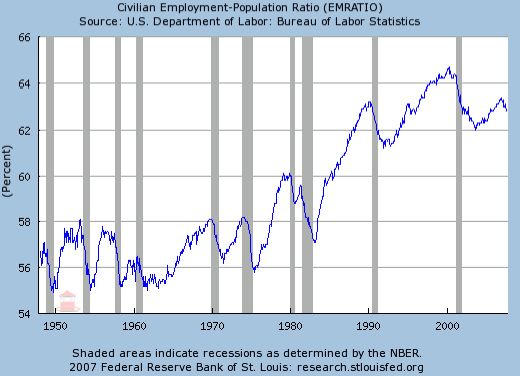
Check out this chart (HT: The Big Picture):

There are a lot of interesting and simple things to observe in this chart. Note that the axis starts at 54%, but still, there has been a significant increase in labor force participation over the last fifty years. Most of that increase has come in the last thirty years, beginning around 1975.
The increase in the proportion of the population working beginning in 1975 coincides with an increase in the divorce rate. (I don’t have the data handy but divorce rates started soaring in America in the early 1970s. A lot of the people joining the labor force in the mid-1970s were women, some (many?) newly divorced, some (many?) with little labor force experience and some of them were women who had not expected to be working. I would guess that most of these women had wage rates below the average. Adding them to the labor force was very good for them. They were newly single and suddenly had to stand on their own feet. They did. The market created jobs for them.
If I remember correctly, there was also an increase in the 1970s of labor force participation by married women. My guess is that they too, on average, earned less per hour than the existing average wage at the time.
Both of these factors reduced the measured average wage rate in the economy because of a change in the composition of who was included in the average.
Real average hourly earnings as measured by the BLS peaked in the United States in the late 1970s leading some to conclude that the average worker has made no progress. There are many things wrong with using average hourly earnings as a measure of the standard of living. The biggest reason is the mismeasurement of inflation which leads to an underestimate of earnings. A second reason is the ignoring of fringe benefits which have become an increasing part of compensation since the 1970s. A third reason is composition effects—increases in immigration and labor force participation by groups with wages lower than the existing average pull down the measured average but that doesn’t imply others are doing worse.


