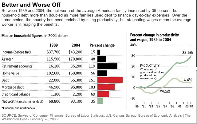
In this post, I showed that net worth per household had risen dramatically in recent years. Of course, I admitted that the average might be skewed by the high end households but that I thought the median was up as well. The Washington Post has a piece today with the data for the median household, Turns out it’s up 35% in real terms (that is, corrected for inflation) between 1989 and 2004. Pretty good news, and the article is generally sympathetic to the surprising possibility that the middle class is thriving.
But the graphic that goes with the article is much gloomier:

I don’t know if you can read it, (you can click on it and make it bigger) but here’s the first sentence that goes with the graphic: "Between 1989 and 2004, the net worth of the average American family increased by 35%, but household debt more than doubled as more families used debt to finance day-to-day expenses."
Here is another way to describe the data: "Between 1989 and 2004, Americans accumulated more wealth. They decided to use some of that wealth for increased consumption today."
Notice the chart to the right on productivity and wages. By ignoring benefits, it paints a much gloomier picture than is the reality.
UPDATE: As Randy pointed out in the comments to this post, $55,000 seems like a lot of debt for the median household. Actually the number is not correct. It’s taken from the Federal Reserve Board’s Survey of Consumer Finances. It’s the median debt among families that have debt, about 3/4 of all families. So it is not analogous to the income in the chart. It’s not clear what kind of debt it includes. When I find out, I’ll post on it.


