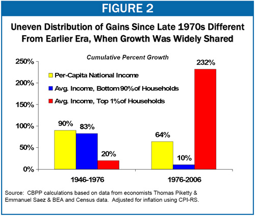
Recently, Don welcomed Muirgeo back to the comments section of the blog and I noticed a mere 242 comments were made in response. I started reading and stopped when I got to the posting of a chart by Muirgeo. I recognized the chart immediately and stopped reading any further into the comments. So forgive me if some people have responded already.

Muirgeo’s comment on the chart is:
"Anyone care to take a shot at explaining this data and how it’s consistent with libertarianism?" I’m not quite sure what to make of this comment. But I’ve seen the chart before and I’ve thought it would make an excellent basis not for a blog post, but rather for a course on how to think about numbers. Certainly the authors of the chart and the authors of the study that the chart is based on, see something wrong with an era where economic growth goes disproportionately to the richest 1%. The implication of these authors (I am not indicting Muirgeo here so let’s stay away from that) is that something has gone terribly wrong with the American economy. Perhaps they are right. And of course there are many things that have been done since 1976 that were wise and many things that have been unwise.
Numerous folks believe, however, that the economy has become too unregulated, too unfettered, too free market since 1976 and that that is what explains the pattern of the data in the chart.
So here’s the contest:
Write ONE sentence explaining ONE thing that is wrong with concluding that these numbers are evidence that the US economy has become more tilted toward the rich at the expense of the poor.
You can submit more than one sentence. But only one at a time. So each comment can have only one sentence. Any comments containing references to Muirgeo or others will be deleted.
I will take the best sentences and post them (with the author’s names) along with the chart along with comments of my own if there is anything else to be said.
At that point, Muirgeo (and others) will have the opportunity to defend the chart or critique the critiques.
Particularly diligent contestants will want to consult this source for further information on how the numbers were generated.
UPDATE: There are now more than 200 comments so I am closing the contest. Tomorrow, August 21, I hope to post the best sentences with some commentary.


