

In reality Covid deaths going from 249,999 to 250,000 is a largely meaningless milestone and the hoariest kind of fake news. When deaths hit 200,000, listeners could already figure out how many more would make 250,000. Many also knew, unmentioned in NPR’s sermon which likened the daily death toll to several jumbo jet crashes, that most of these deaths are from Covid plus other conditions that afflict the old and chronically ill. Still, the 250,000 milestone was the most reported factoid everywhere on Thursday and Friday, so another hint for journalists: If you find yourself straining for ways to sensationalize a claim that listeners have already heard 50 times, maybe just drop it and move on.
In our interesting times, sadly, what is most noticeable is the shrill, hoarse wind of banality that blows from our multibillion-dollar media industry. A contrast last week was a concise insight from a hospital executive buried in a long New Yorker article: “The only way you can eradicate the virus with today’s tools is if you’re a totalitarian government or on an island.”
Also decrying the “blizzard of bogus journalism on Covid” is Jeffrey Tucker. A slice:
There are hundreds of ways to look at Covid-19 data. The Times picked the one metric – the least valuable one for actually discerning whether and to what extent people are sick – in order to generate the result that they wanted, namely that open states look as bad as possible. The result is a chart that massively misrepresents any existing reality. It makes the worst states look great and the best ones look terrible. The visual alone is constructed to make it looks as if open states are bleeding uncontrollably.
David Stockman (behind a paywall) factually and powerfully pushes back against the media-fueled Covid Derangement Syndrome. A visual slice:
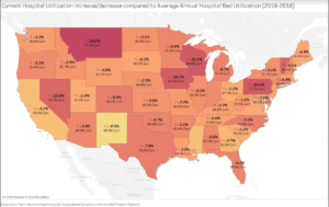
(Apologies for my being unable to make this image larger. It shows current [November 1-9] hospital utilization rates compared to average annual hospital utilization 2016-2018. Today’s reality appears to be nowhere near the “crisis” about which the media and many politicians are screaming.)
And a verbal slice:
Here are the the seven-day averages for the three peak periods. As between the April peak and the seven-day average as of November 18, the number of tests is up by 9.6X, the number of cases stands at 5.1X and WITH-Covid hospitalizations have risen by just 1.2X.
New Tests Per Day (seven-day average):
- April 11: 163,400;
- July 23: 884,675;
- November 18: 1,565,872;
- Nov. vs. April: 9.6X
New Cases Per Day (seven day average):
- April 11: 39,750;
- July 23: 66.500;
- November 18: 157,220;
- Nov. vs. April: 5.1X
WITH-Covid Hospitalizations (seven day average):
- April 11: 59,900;
- July 23: 59,700;
- November 18: 72,000;
- Nov. vs. April: 1.3X
Of course, the ultimate test of disease severity is the mortality rate, but that metric, fortunately has tracked neither the testing rate nor the daily case count. In fact, the seven day average for November 18 is actually 43% below the peak rate of April.
WITH-Covid Deaths (seven day average):
-
-
April 21: 2,116;
-
August 4: 1,107;
-
November 18: 1,209;
-
Nov. vs. April: 0.57X
-
UPDATE: Dave O’Neil discovered an arithmetic error in Stockman’s calculations. It’s this: The November ‘new cases per day (seven day average)’ is 4.0 times higher than the April figure, not 5.1 times. Mr. O’Neil’s note prompted me to check all of Stockman’s “X” calculations above. I discovered that the November ‘WITH-Covid hospitalizations (seven day average)’ is only 1.2 times higher than in April (not 1.3 times higher).
Amelia Janaskie explains the harm that Covid-19 lockdowns inflict on women.