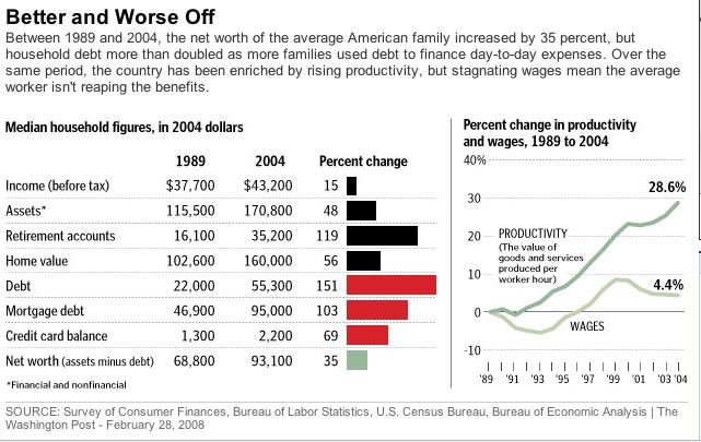
As I mentioned in this post, there were some strange things in the Washington Post article on the middle class, particularly in the graphic:

So let’s take a closer look. As Randy pointed out in the comments, $55,000 seems like a lot of debt for the median family in 2004. Look again. According to the chart, debt is $55,000 but mortgage debt by itself is $95,000. A reader might think that the $55,000 is on top of mortgage debt. The description around the graphic says: "household debt more than doubled as more families used debt to finance day-to-day expenses." Is that what that $55,000 is about? Is that on top of mortgage debt? Whoa.
Well, no, it turns out.
The chart is incredibly misleading. Only the top line (income) and the bottom line (net worth) are true medians measured across all families.
The debt figure of $55,000 in 2004 (which supposedly is 151% higher than in 1989 to pay for day-to-day expenses) is actually ALL forms of debt INCLUDING mortgage debt. So how can that be? How can the median family have only $55,000 of all kinds of debt when there’s $95,000 of mortgage debt all by itself?
That’s because each line of the chart (other than the top line and the bottom line) is a subset of all families and a different subset.
So among families that have mortgage debt (maybe 40-50% of all families) the median mortgage debt among those families is $95,000.
But among families that have any kind of debt, (about 3/4 of all families) the median indebtednes including all kinds of debt is $55,000. That includes mortgages debt. So that $55,000 number has nothing to do with "day-to-day" expenses. And the scary 151% increase in "Debt" from 1989 to 2004 includes people choosing larger mortgages and nicer cars and going to college and everything people finance via borrowing.
So you can’t add up any of the lines of the chart or even compare them to each other. They’re each for a different subset of the population, the population who have that kind of debt or asset.
(This explanation of how those numbers must have been calculated comes from a Federal Reserve Board economist who compared the numbers in the Post graphic to Fed data from the Survey of Consumer Finances.)
The bottom line is the bottom line—net worth is up. That’s a good place to start. The rest of the chart is basically meaningless for drawing the kind of conlcusions implied in the text.


