

I have written many times that the subsidies to Wall Street and its employees have distorted economic outcomes for a handful of folks relative to the rest of us. So I want to start by pointing out that there is at least one source of inequality that is destructive to democracy and capitalism.
But there are many other sources of inequality that have nothing to do with our economic system or with public policy.
John Cassidy at the New Yorker has an article on the new Washington Center for Equitable Growth and a recent conference on inequality. Cassidy produces six charts to try to capture what is going on. Here is one of them:

Let’s just look at the bottom 99%, the clear light circles. Put all your biases aside for a moment. Just look at it and try to summarize what you see. I see four different eras. From 1913 until roughly 1940, it’s flat. From 1940 to 1973, it’s rising almost steadily, roughly tripling. Then for 20 years, 1973–1993, it’s basically flat. Then in 1993, it starts to rise but the increases are erratic.
This is family income, by the way, at least that’s what Cassidy says.
No matter how you look at it, the growth rate in family income (as measured by these data at least) changed dramatically around 1973.
Is this a big deal? It sure seems like it. But if you want to make a big deal out of it, don’t you want to have some kind of idea as to what caused the change?
When the left talks about the middle class being “hollowed out,” or stagnation in the standard of living of average American, they like to blame it on declining unionization, a fraying social contract between business and labor, or the rich hoarding more for themselves and leaving less for the rest of us via tax policy or regulation. But none of these kinds of explanations are likely to explain the sharpness in the change of the rate of growth starting in 1973. Private sector unionization has been declining steadily since 1950. I don’t think the social contract got revised in an especially tough way in 1973. And I don’t think the rich had a big confab in 1973 when they remade public policy. Was there a big change in tax policy or regulation in 1973. If there was, I missed it.
There was an increase in the price of oil. But it’s hard to understand how that changed incomes for 20 years. It went up again in the late 1970’s but then it fell through much of the 1980’s. So that doesn’t seem like a very good explanation. (You can play with the oil and gasoline data here.)
(And before I go any further, I do want to mention that the bottom 99% and the top 1% are not the same people over time.)
Now it could be that declining unionization does affect everyone’s wages. Maybe it has to decline to a certain point before it has a big effect. There’s a threshold effect and the threshold was reached in 1973. It’s possible. But that’s just a guess. It’s not convincing to anyone who isn’t already convinced.
Let me suggest a different explanation for the change that took place in 1973. It’s a simple explanation. It has to do with demographics so it’s not as exciting as some nefarious plot to kill the unions or tear up the social contract between business and labor. Here’s the key picture:
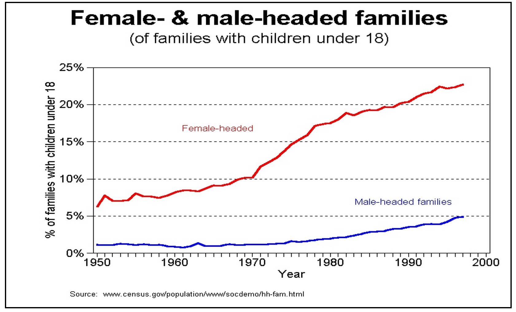
What people often forget, especially economists, is that there were huge changes in family structure in the 1960’s and 1970’s. There was a big increase in the divorce rate and a big increase in the number of households headed by women. The increase in the divorce rate was much larger among poor families than it was in rich families. It also grew more dramatically. So as a result, family composition changed dramatically. (The graph isn’t mine by the way. I took it from a sociology prof’s web site at the University of Maryland. But I’ve checked the numbers with the Census numbers. They appear to be right.)
Starting around 1971 or 1972, the increase in the proportion of families with children that were headed by women rose draatically. Female-headed households became more numerous generally compared to other types of families. In 1970, about 5% of all families were families with children headed by a woman. By 1991, the proportion had doubled to about 10%. Female-headed households with children tend to have lower income for lots of reasons. That demographic change is going to slow the average measured rate of growth, especially when those families are disproportionately created out of married families that are poorer than the average to begin with.
Of course this particular graph is particularly attractive for my claim because of the clear change in slope around 1971 or 1972. But that isn’t decisive. It’s a change in the proportion of families with kids which isn’t necessarily the key variable. If you drew it as a proportion of all families, I’m not sure it would be as dramatic. The chart I used is the one I happened to stumble on. But go here and scroll down until you hit the section on poverty rates and you’ll see that the change in family structure, particularly the growth in the proportion of families headed by women with children, made a huge difference to how fast the poverty rate fell while the economy was growing between 1970 and 2000.
I don’t know if these demographic changes explain all of the change in the growth rate of the standard of living of the 99%. But before I drew strong conclusions about the effectiveness of the American economy to deliver a decent standard of living, I would want to take demographics into account. If the Washington Center for Equitable Growth is serious about inequality, they ought to look into the role of demographics.
And of course even if demographic change explains the change in the growth of the average standard of living. you can still favor redistribution to poor families or to families headed by women with children. But I suspect if we had a better understanding of the role of demographics there would be different policies people might support.
UPDATE: I have added this post to make the intuition behind the effect of divorce clearer.